The Problem
Existing web platforms evolved without a unified design approach, leading to inconsistent patterns, difficult navigation, and fragmented experiences. This impacted usability for users and made maintenance and scaling harder for internal teams.
The Goal
The goal was to redesign and modernize Rezon's web platforms by:
- Improving usability through more user-centered design decisions;
- Simplifying navigation and strengthening information architecture;
- Introducing consistent and reusable patterns across platforms;
- Laying the foundation for a more scalable design system over time.
Research
Competitor Analysis
I reviewed competitor websites to understand common navigation patterns, content structures, and interaction design approaches. This helped identify opportunities to simplify the experience, improve consistency, and apply more familiar usability patterns where appropriate.
Heuristic Evaluation
I conducted a heuristic evaluation of the existing platforms to identify key usability issues. Key findings included:
- Cluttered layouts and weak visual hierarchy;
- Inconsistent UI and interaction patterns;
- Unclear navigation and content structure;
- Basic accessibility gaps (contrast, readability).
User Insights
Through internal feedback and cross-functional collaboration, I identified recurring issues across multiple platforms. The same usability problems appeared consistently:
- Difficulty finding key content;
- Confusion caused by inconsistent patterns;
- Lack of clear structure.
Final Designs
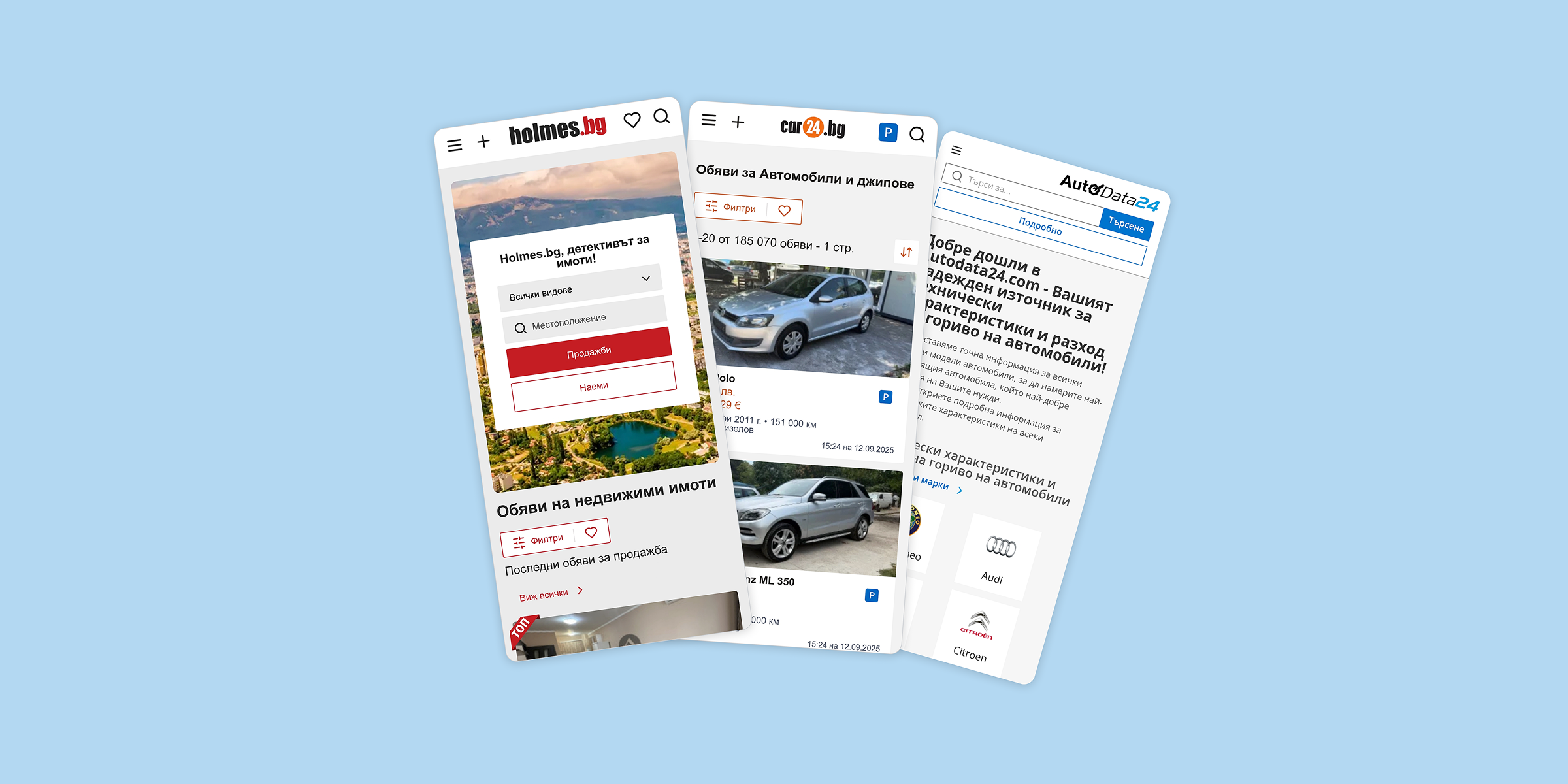
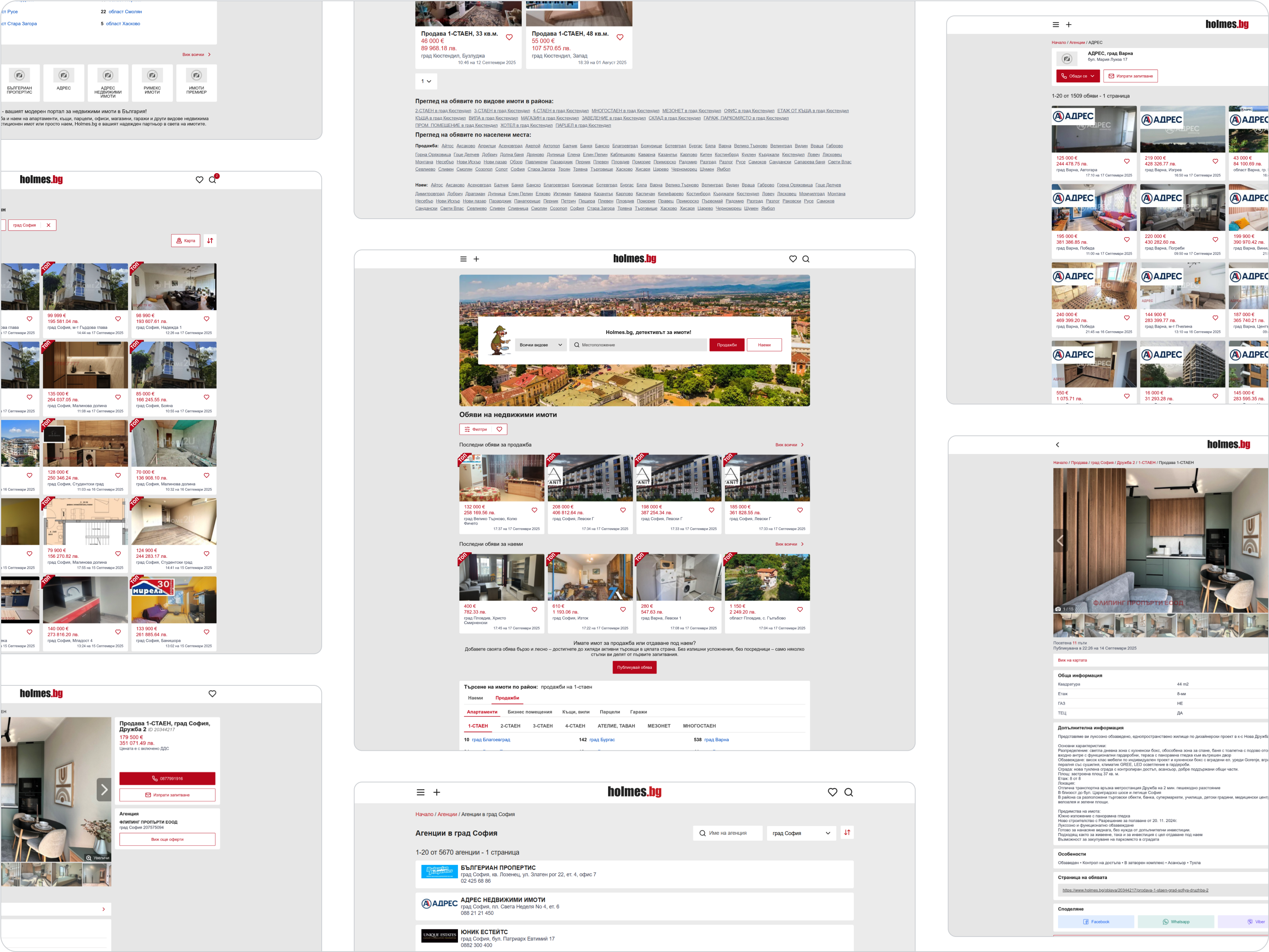
Holmes.bg
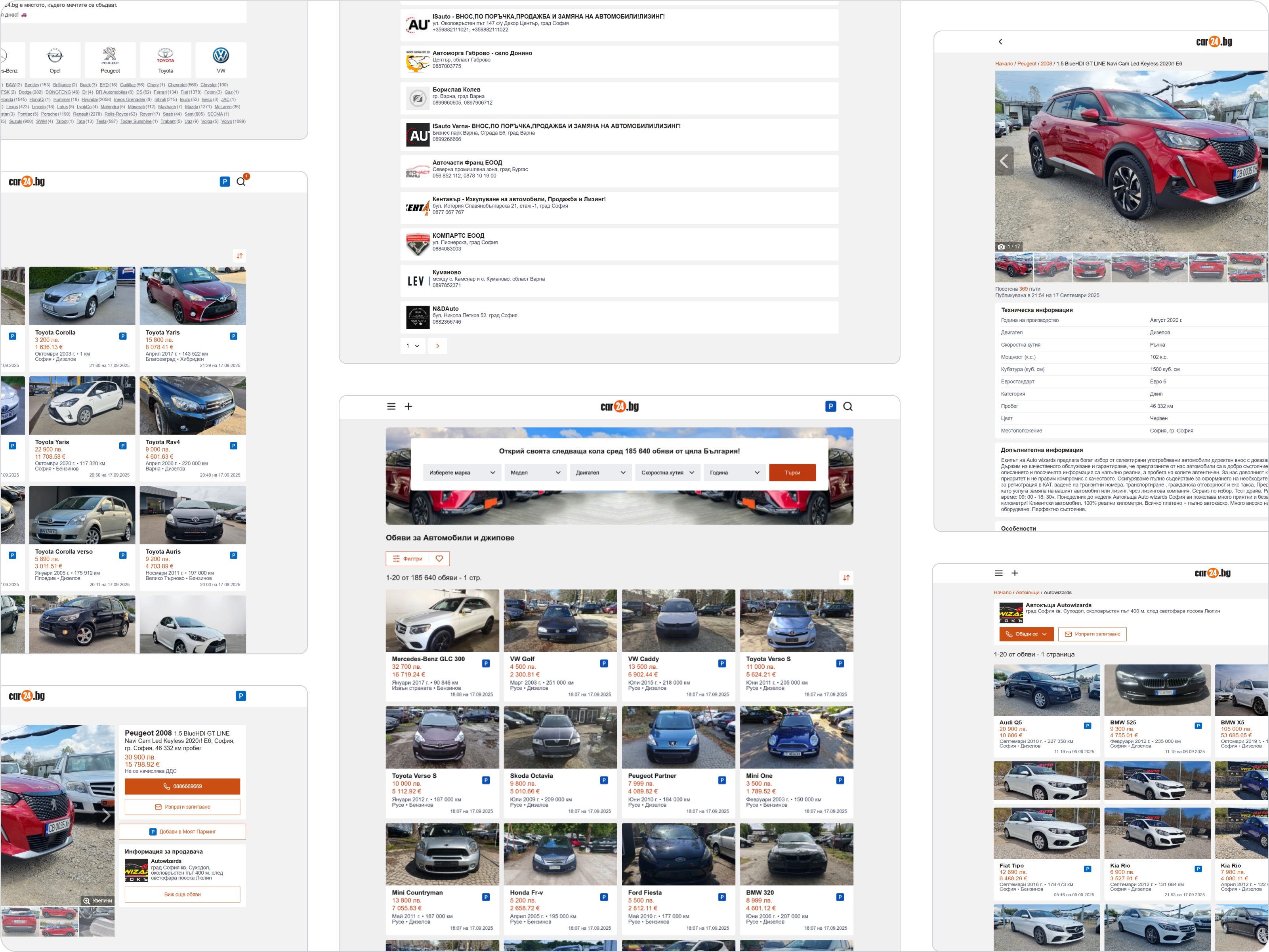
Car24.bg
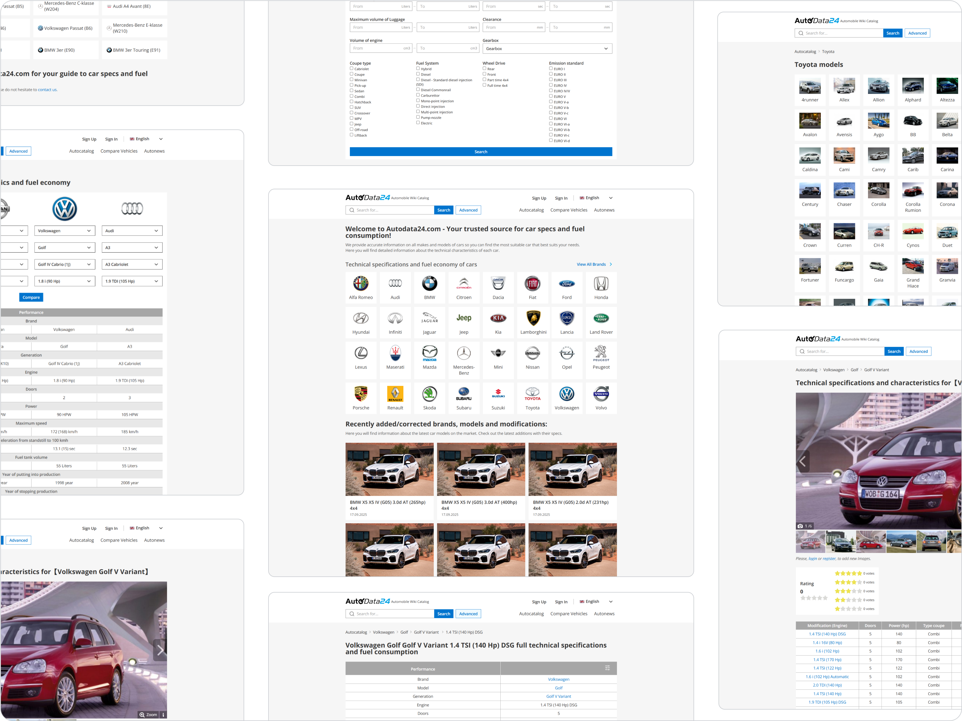
AutoData24.com
The Outcome
Redesigning for Impact
The redesign improved usability and created a more consistent experience across multiple platforms. Simplified navigation and clearer structure made content easier to access, while introducing reusable patterns helped reduce inconsistencies and support a more scalable approach over time. The use of shared templates and collaboration with development also helped streamline implementation and reduce repeated work.
Key Insights
- Simplified navigation reduced the steps needed to access key content, improving overall usability;
- Reusing established patterns created a consistent and predictable user experience across platforms;
- Starting with a single platform allowed solutions to be validated before scaling to other projects;
- Flexible templates minimized repetitive design work and supported faster iteration and updates.